Resizing and compression are not the same thing
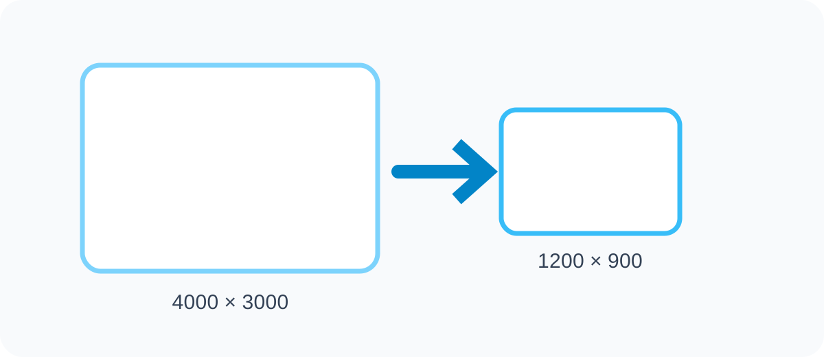
Resizing changes the pixel dimensions of an image, such as reducing a photo from 4000×3000 pixels to 1200×900 pixels. Compression changes how efficiently the image data is stored. Both can reduce file size, but they solve different problems.
If a website only displays an image at 800 pixels wide, sending a 4000-pixel original wastes bandwidth even if the file is compressed. A strong workflow usually chooses sensible dimensions first and then applies appropriate compression.
Why images become blurry after resizing
Downscaling usually looks good because several source pixels are combined into fewer output pixels. Upscaling is harder because the software has to create additional pixels that were not present in the original. Standard resizing cannot recreate real detail that was never captured.
Blur can also come from repeated resizing, poor interpolation, excessive JPEG compression or stretching an image without preserving its aspect ratio. Always start from the best available source and create new output copies rather than repeatedly editing the same small file.
Understand aspect ratio before changing dimensions
Aspect ratio describes the relationship between width and height. A 1600×900 image has a 16:9 ratio. If you change the width without adjusting the height proportionally, the picture can become stretched or squashed.
Most resizing tools offer an option to lock or preserve aspect ratio. Keep it enabled unless you intentionally need different proportions. If a destination requires a square or vertical format, cropping is usually better than distorting the image.
- 16:9 for many landscape displays
- 1:1 for square posts and avatars
- 4:5 for common portrait social layouts
- 3:2 and 4:3 for many camera images
Choose dimensions based on actual use
There is no single ideal image size. Website thumbnails, product photos, presentation slides and social posts all have different requirements. The correct dimensions are large enough for the largest expected display size but not dramatically larger.
For responsive websites, multiple image sizes are often generated so mobile devices do not download desktop-sized assets. For manual workflows, choose a practical maximum width, preview the result and keep the master image separately.
Resolution, DPI and screen images
People often confuse pixel dimensions with DPI or PPI metadata. For normal web display, the browser primarily cares about pixel dimensions. A 1200×800 image contains the same number of pixels whether a metadata field says 72 DPI or 300 DPI.
DPI becomes more relevant for printing because physical print size depends on how many pixels are placed into each inch. A file that looks sharp on a phone may not have enough pixels for a large print.
A practical quality-preserving workflow
Keep the original image, determine the required final dimensions, preserve the aspect ratio, resize once and then export in a suitable format. For photographs, JPG or WebP can provide efficient delivery. For transparent graphics, PNG or WebP may be more suitable.
Inspect text, edges and faces after export. If the result looks soft, verify that you did not upscale a small source or apply too much compression. If the file is still too large, adjust compression quality before shrinking dimensions below the required display size.
- Start from the highest-quality source
- Resize only once when possible
- Preserve aspect ratio
- Use realistic output dimensions
- Choose the correct image format
- Keep a master copy
Resizing images for website performance
Large images are one of the most common causes of unnecessarily heavy web pages. A camera photo can be several megabytes even though the website displays it at a fraction of its original size. Resizing before upload can reduce transfer size dramatically.
Good website image optimization combines appropriate dimensions, efficient formats, sensible compression and responsive loading. Resizing is therefore not just a design task; it is also a performance task.
When cropping is better than resizing
If the destination has a different shape from the source, cropping removes unwanted outer areas while preserving the proportions of the remaining image. This is usually better than forcing a landscape image into a square by stretching it.
For profile photos, product cards and social media templates, crop first to the desired aspect ratio and then resize the cropped result to the final pixel dimensions.